Green Interior Design Ideas: How to Decorate Your Home With the Color of Nature
When thinking of green, nature is one of the first things that comes to mind. Green represents growth, renewal, and life, and is often associated with feelings of refreshment, peace, rest, and even security. The natural echoes of green are what make it a perfect selection for interior design.

📷 Ron Goh
Not only does green have an emotional impact, but it also happens to be a very fashionable color. If you're looking to bring balance and harmony to your home - as well as a slice of the outdoors, indoors - here's how to harness the power of green:
How to Use Green as a Bold Accent in Your Home
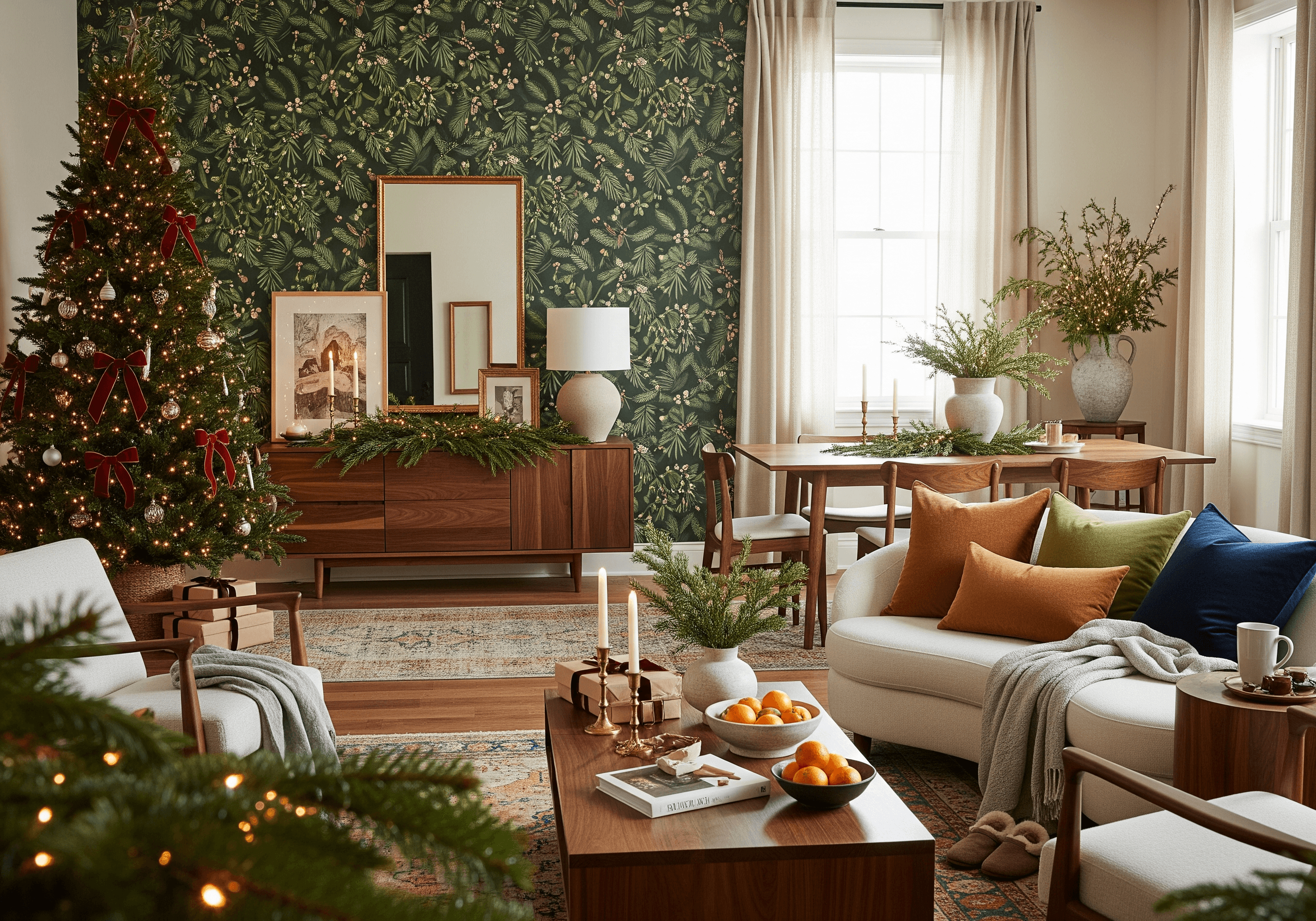
Green is versatile and works as both a backdrop and a standout color. Monochrome colors set against a green accent wall look particularly sleek and stylish, and ideal for shared living areas or spots with lots of natural light. Emerald green is classic and very on-trend at the moment because it gives the allure of royalty and when contrasted with matte blacks are extra sensual. In fact, many hotels have adopted this color palette lately.
Monochrome colors look even more vibrant when balanced with green. Learn how to master this aesthetic in our guide to white interior design tips.


📷 Heena
Another bold option is to create a focal point with a dash of green furniture: for example, a green table and chair set in the kitchen or a low-hanging green light fixture. Green drapes are also striking and help to elongate a space. Less dramatic (and less expensive) focal points can be made with a framed green collage by printing photos with green filters and sepia tones, then hanging them on the largest wall.
Pairing green with white surfaces or bold accents can create striking results—explore more eye-catching color combinations that can transform your home.

For something softer, light greens blended with greys and beiges are reminiscent of warm spring weather. Alternatively, light greens can transform childrens' rooms into futuristic and playful settings - when combined with a space theme or pop art, the effect is even greater.
Pastel greens pair beautifully with cool tones. For more ideas, discover our favorite blue interior design shades and combinations.
Pair Green With Natural Textures and Earthy Materials
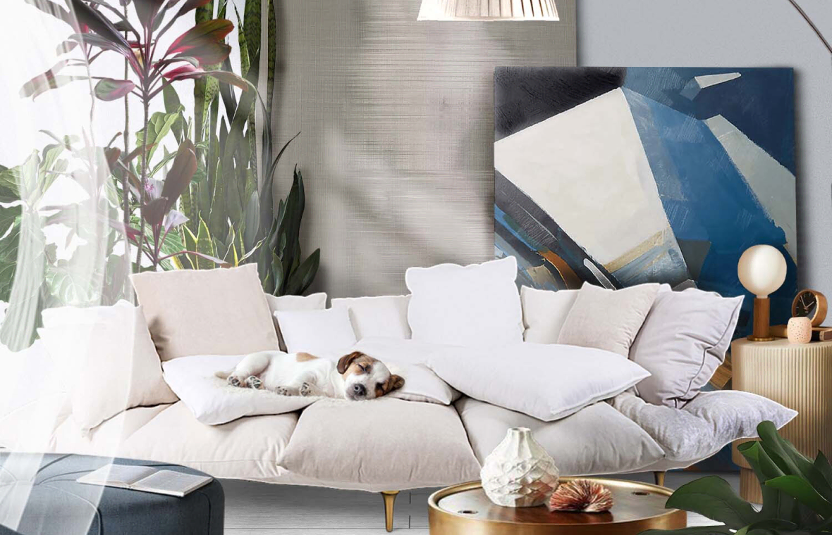
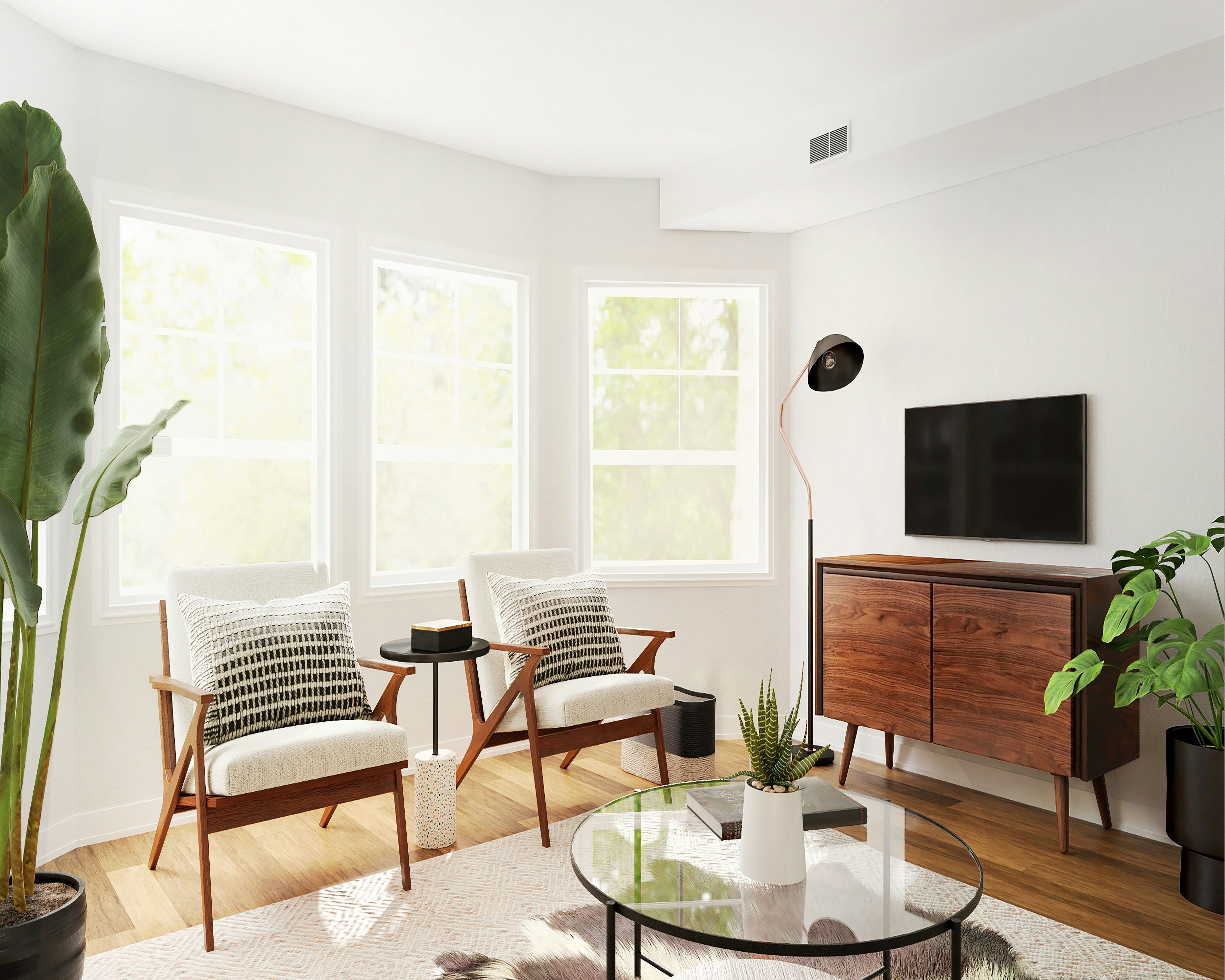
Because of green's association with nature, it pairs really well with materials like glass, stone, wood, cork, and bamboo. Integrate these among green palettes for an earthy feel - a fiber rug is especially cool.

📷 Kelsey

For a smoother finish, several shades of green can give the impression of a velvet texture. On walls, use bunched-up cotton rags to move wet pain around and achieve the suave aesthetic. Then, add mirrors to reflect light points and cast geometric shapes (this works best for darker green tones). Or if you prefer a more vintage design, dot green leather armchairs and marble trimmings throughout the room.

📷 Courtney
Over in the kitchen, green tiling on the floor or as the backsplash looks chic if done sparingly and with delicate patterns. This technique can also emphasize white surfaces nearby, giving a polished appearance in rooms that can get dirty quickly.
Decorating With Green Plants to Complete the Look
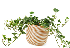
No green theme is complete without a few plant additions, plus plants aid concentration, productivity, and even happiness.

Scattered or grouped together, plants near a window or in a corner breathe freshness into space, while hanging plants or vertical gardens add layers. Elsewhere, plants can be a centerpiece to a room, tying together the different elements that are present. For instance, blooming leafy plants make a room appear more spacious while blossoming flowers create a picturesque ambiance.
Whether real or fake, green plants can be used as dividers in cluttered sections too. They can be organized between items on bookcases or nestled between place settings on a dining table. Don't be scared to buy green plants either - go the full mile and commit to green so long as you're not oversaturating things.

It's no surprise that green is a popular color in homes. Green has the special ability to convey abundance without being overwhelming, as well as add a touch of scenery to urban spots. Interestingly, the human eye is most sensitive to green and can distinguish the most shades of it - in interior design then, green is evocative and timeless.
Bring Green to Life in Your Home With the DecorMatters App
Ready to transform your space with the calming power of green? Use the DecorMatters app to explore green interior design ideas, visualize accent walls, layer natural textures, and decorate with indoor plants—all from your phone. Download now and design your perfect nature-inspired home.
UP NEXT: Enhancing Your Home's Interior Design With Color Psychology


 22h left


