Creating the Perfect Gallery Wall: The Do's and Don'ts of a Picture-Perfect Display
Designing a gallery wall might appear straightforward at first glance, but it actually involves a fair amount of artistry. A thoughtfully crafted gallery wall enhances your home’s aesthetic, reflects your unique story, and creates visual balance throughout your space.
However, without careful consideration, it can easily turn into a hodgepodge of mismatched pieces. Whether you’re showcasing artwork, photographs, or cherished mementos, this guide outlines the key do’s and don’ts for curating a display that feels cohesive, appealing, and distinctly yours.
The Do's
Plan Your Gallery Wall Layout Before You Hang Anything
The excitement of creating a gallery wall can often lead to the urge to immediately start hammering away. However, one of the fundamental principles of a successful gallery wall is the art of planning. Think of this step as the rehearsal before the grand performance.

Here are a few additional reasons and tips for why planning your layout is vital:
- Visual Balance: On the floor, you can gauge the visual weight of each piece. Larger frames or bolder artworks naturally draw more attention and should be balanced out with smaller, subtler pieces.
- Spacing Consistency: By laying everything out, you can ensure consistent spacing between each frame or piece of artwork. This consistency can be the difference between a gallery wall that looks thoughtfully designed versus one that appears haphazard.
- Thematic Flow: If your gallery wall has a theme, be it a color scheme or a particular subject, arranging ahead of time ensures that the theme is evident and flows seamlessly across the wall.
- Avoiding Wall Damage: Repeatedly hammering and removing nails can damage your wall and lead to unnecessary repairs. Planning on the floor minimizes errors and preserves the integrity of your wall.
- Incorporate Paper Templates: If you want to be extra meticulous, after laying out your frames on the floor, create paper templates of each piece. Tape these templates to the wall, rearranging as necessary. This gives you an even clearer preview of the end result and ensures that every nail you hammer in is purposefully placed.
Mix Frame Sizes and Shapes for Visual Interest

When curating a gallery wall, variety truly is the spice of life. Mixing different sizes and shapes of frames and art pieces not only breaks the monotony but also lends an eclectic charm to the display. A larger frame can serve as a commanding focal point, a piece that immediately grabs attention. Surrounding it with smaller frames of varying shapes can then guide the viewer's gaze across the entirety of the wall, ensuring every piece gets its moment in the spotlight.
When different sizes and shapes are thoughtfully arranged, they offer balance. While uniformity has its charm, it's the unexpected combinations that often leave a lasting impression.
Keep Spacing Consistent Between Each Piece
One of the fundamental principles in arranging frames on a wall is the maintenance of consistent spacing between each piece. It is crucial to decide on a specific distance, be it 2 inches or 5 inches, and stick to it throughout the arrangement. Uniformity in spacing ensures that each frame complements the next, lending a sense of rhythm and predictability to the display.

Conversely, erratic spacing can make a wall feel chaotic, haphazard, and even overwhelming to the viewer. By keeping the spaces consistent, you can create a gallery-style wall that looks professionally curated and invites viewers to engage with each piece individually, while also appreciating the collective visual story.
Add Personal Touches for a Unique Gallery Wall

Gallery walls are more than just a decorative trend; they're an intimate reflection of one's life, experiences, and memories. Instead of sticking solely to conventionally framed art pieces, infuse your arrangement with cherished mementos that hold sentimental value. Perhaps it's a travel souvenir from a trip that transformed your perspective, a handwritten note from a loved one, or a vintage family heirloom that evokes nostalgia. These personal items not only enhance the uniqueness of your gallery wall but also create a direct connection between the viewer and the stories you wish to share.
Use Lighting to Highlight Your Artwork
Lighting plays a pivotal role in accentuating the beauty and depth of a gallery wall. Positioning your gallery wall in a well-lit area ensures that each piece is showcased to its fullest potential, revealing the nuances in color, texture, and detail.

Introducing specialized lighting options, such as elegant picture lights or chic sconces, can be a game-changer. These lights focus attention, guiding the viewer's gaze to specific artworks or areas, ensuring that no detail goes unnoticed.
By giving lighting the consideration it deserves, you're not just lighting up frames; you're illuminating stories, emotions, and memories, enhancing the overall experience of the gallery wall for both yourself and your guests.
The Don'ts
Don’t Overcrowd Your Gallery Wall
While it would be amazing to showcase every artwork, photo, or every memorabilia special to us, there's a fine line between a well-curated display and one that's overly congested.
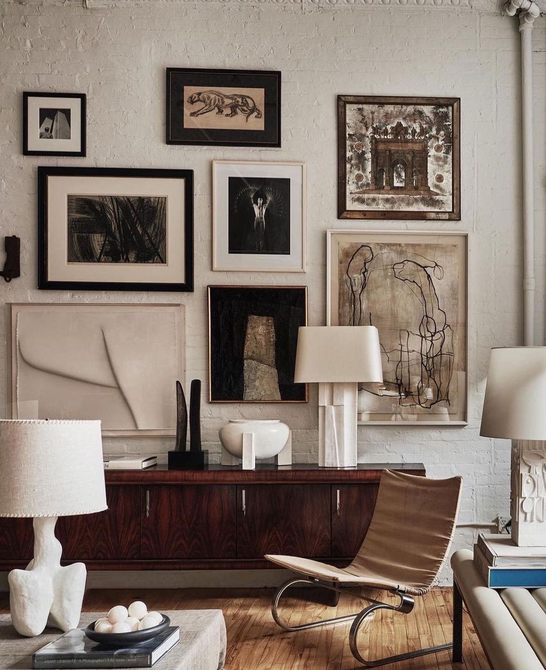
Cramming too many items close together can not only diminish the individual beauty of each piece but also create a cluttered feel that overwhelms the viewer's eyes. Such an arrangement can detract from the intended visual impact and make the space feel chaotic.
It's essential to remember that in design and art, empty spaces, or 'negative space', have their own value. They offer breathing room, allowing each piece to stand out and be appreciated in its own right. As with many things in life, when it comes to curating a wall or any display, sometimes less truly is more.
Don’t Ignore the Room Around Your Wall
A gallery wall, while a focal point, should not exist in isolation. It's a piece of a larger jigsaw puzzle that is the room itself. Ignoring the interplay between the gallery wall and the room's other elements can lead to a disjointed or overwhelming space.
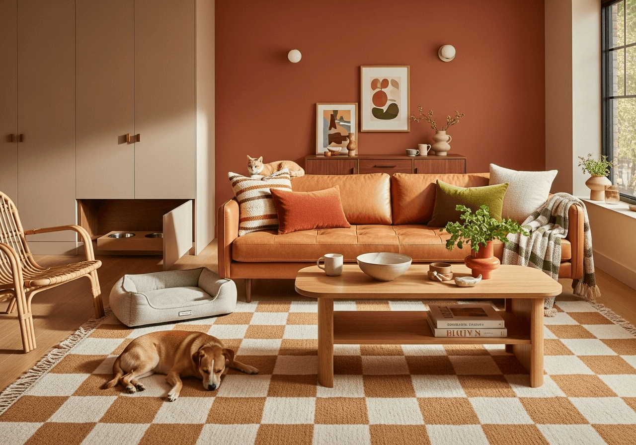
First and foremost, consider the furniture. The scale, design, and position of pieces like sofas, tables, or shelves can greatly influence how one perceives the gallery wall. For instance, a gallery wall above a minimalist couch might afford more intricate artworks or busier arrangements, while one above a more ornately designed seating might demand more restraint.

Next, the color palette of the room plays a significant role. The hues and tones of the gallery pieces should resonate with the room's colors, creating a flow rather than a jarring contrast. It doesn't mean the colors need to match exactly, but they should exist in harmony.
Lastly, the room's purpose is crucial. A tranquil bedroom might benefit from a gallery wall that exudes calm and serenity, while a lively living area might embrace bold and dynamic pieces. By being mindful of the room's function, one can choose artworks that enhance the desired mood and ambiance.
Don’t Limit Yourself to Just Framed Art
When curating a gallery wall, it's essential not to restrict yourself to the conventional realm of framed prints or photos. Incorporating varied elements such as textiles, sculptures, or even artistic wall decals can inject a sense of depth and texture, breaking the monotony and introducing an exciting, multidimensional facet to your display.

Textiles: A woven tapestry or a cherished fabric piece can add warmth and richness, weaving stories of craftsmanship and tradition into the mix. Their softness contrasts beautifully with the rigidity of the frames, offering visual relief and a touch of the unexpected.
Sculptures or 3D Wall Hangings: These wall decor introduce depth and shadow play. Whether it's a delicate metal work, a carved wooden piece, or even a modernistic ceramic creation, these objects invite viewers to engage from multiple angles.
Wall Decals: Wall decals offer a blend of art and graphic design. They can provide whimsical motifs, inspiring quotes, or even illusionary elements, making sections of the wall pop with a burst of creativity.
Don’t Rush the Process—Curate Over Time
While the excitement to see a finished wall is understandable, it's crucial to recognize that building the perfect gallery wall isn't a race.
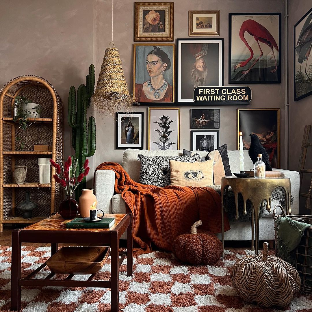
Taking the time to methodically select each piece ensures that every item on the wall has a purpose, a story, and a connection to the overarching theme or emotion you wish to convey. Hastily chosen artworks or photographs might not evoke the same feelings or mesh well together, leading to a disjointed or incoherent display.
Don’t Forget to Anchor With a Strong Centerpiece
When creating a gallery wall, the central piece can set the tone, theme, and balance for the entire arrangement. This is why the middle should never be overlooked or underestimated.

Starting with a prominent or cherished piece in the center can be likened to laying the keystone in an arch; it provides both a structural and visual foundation. When this centerpiece is in place, it offers a sense of scale, guiding decisions about the size, color, and spacing of surrounding pieces.
As you work outwards from this central focal point, you're able to maintain symmetry and balance. Whether the subsequent pieces are harmonious in color, contrast in style, or vary in size, having that central anchor ensures that the arrangement doesn't feel lopsided or haphazard. It provides a visual guidepost, a touchstone that all other pieces can relate to.
Create Your Perfect Gallery Wall

Crafting the perfect gallery wall intertwines both artistic intuition and structured design. By combining diligent planning with design knowledge and your unique touch, you're set to manifest a display that captivates the eye and resonates with your soul each time you glance its way.
Ready to build your dream gallery wall? Use the DecorMatters app to visualize layouts, plan frame placement, and design a personalized display with ease. Whether you’re creating a photo wall above your couch or curating art in your hallway, download the app today and bring your gallery wall vision to life—no guesswork required.
UP NEXT: 36 Creative Photo Wall and Gallery Wall Ideas for a Personal Touch



 22h left


