- Design Your Room
- AI Design
- Explore
- Blog

How to Create the Perfect Color Palette for Your Home: Expert Tips & Inspiration
Choosing the perfect home color palette doesn't have to feel overwhelming. With countless shades at your fingertips, finding colors that truly speak to you can transform your home into a personalized haven. Whether you're moving into a new space, repainting a room, or simply refreshing your current decor, a cohesive color scheme is essential to create harmony and style.
Our expert color guide will simplify the process by showing you how to: select colors that reflect your personality and desired home aesthetic, build a cohesive and flowing color scheme throughout your home, and understand how lighting influences color and why wall color is crucial.
Using the DecorMatters app, you can easily test different color combinations, visualize your space before committing, and create a professional-level interior color palette—all with the tap of a button.
Now, let’s get started on designing your perfect color scheme!
How to Choose Colors That Match Your Personality

The colors in your home affect your mood, energy, and productivity. According to color psychology in interior design, different shades create different emotions:
Blue evokes calmness—great for bedrooms and offices.
Green promotes relaxation—perfect for living rooms.
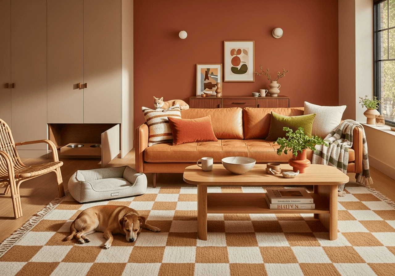
Warm tones like red and orange boost energy—ideal for kitchens and dining spaces.
Firstly, think: What colors do you usually wear day-to-day? If you like floral prints and bright patterns, bring them into your bedrooms and living rooms in the form of lampshades, pillows, and throws.
A crimson red may remind you of that dress you wore when you met the love of your life. Turquoise blue may be reminiscent of that day of scuba diving in the great barrier reef. Harmonious green hues may take you back to that ayahuasca retreat in the Amazon.
Whatever the memory that triggers endorphins to be released, get on the DecorMatters app and play around with that color to see what opportunities it presents for your home. In fact, why not upload a photo from your favorite trip away to a color generator? The tool can scan it fast and tell you what shades appear.
How to Create a Cohesive Color Flow in Your Home

Most people have a color palette in mind as they decorate a room, but not everyone thinks about the home’s color scheme as a whole. Colors must flow from room to room.
Color Theory, based on extensive knowledge about psychology and the human optical ability, is a collection of rules that marketers often refer to in order to communicate with users through appealing color schemes. Think about your journey through your house as marketers think about user experience: Design for accessibility and functionality.
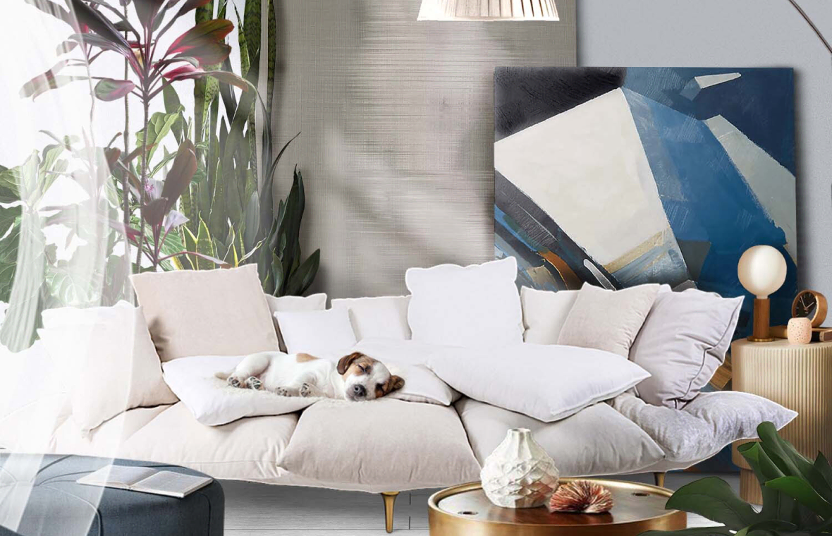
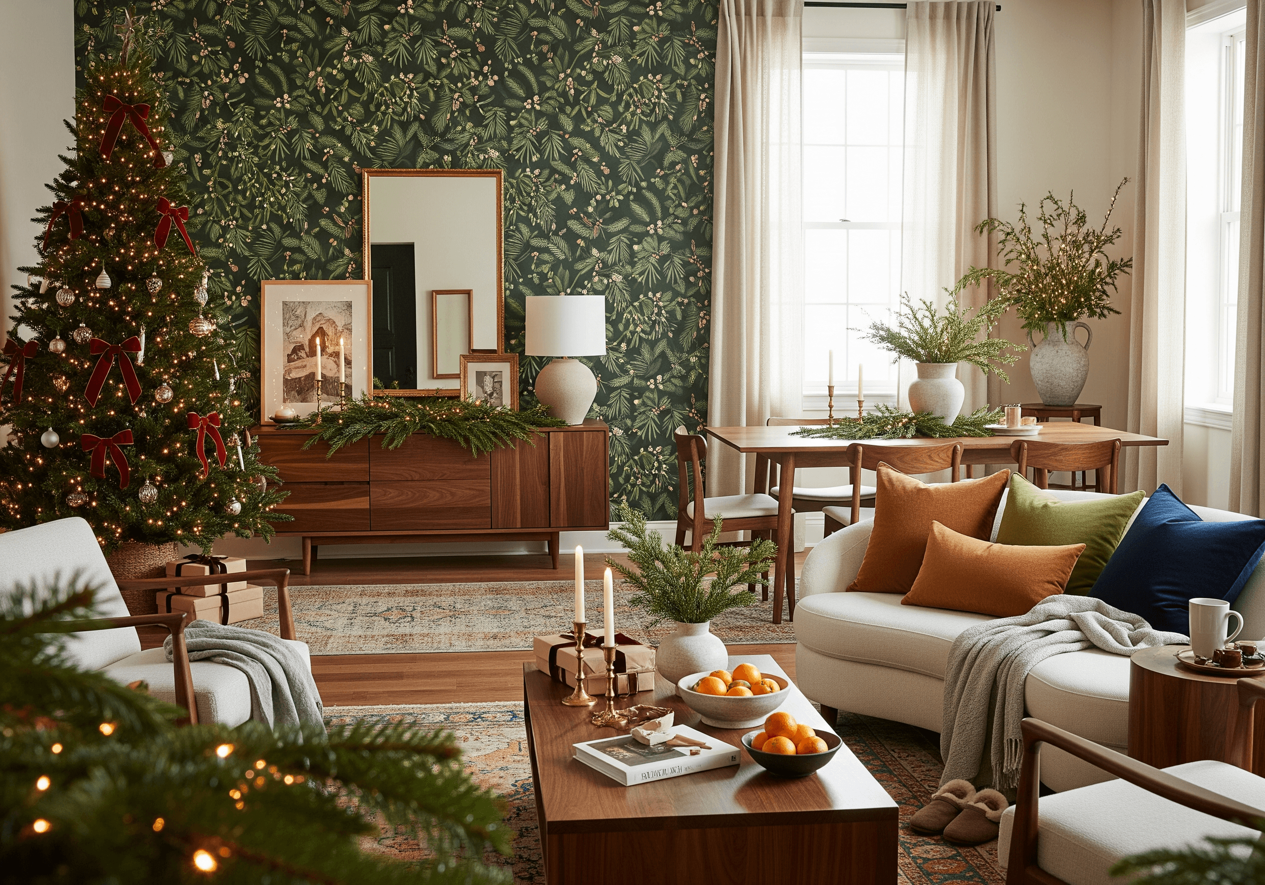
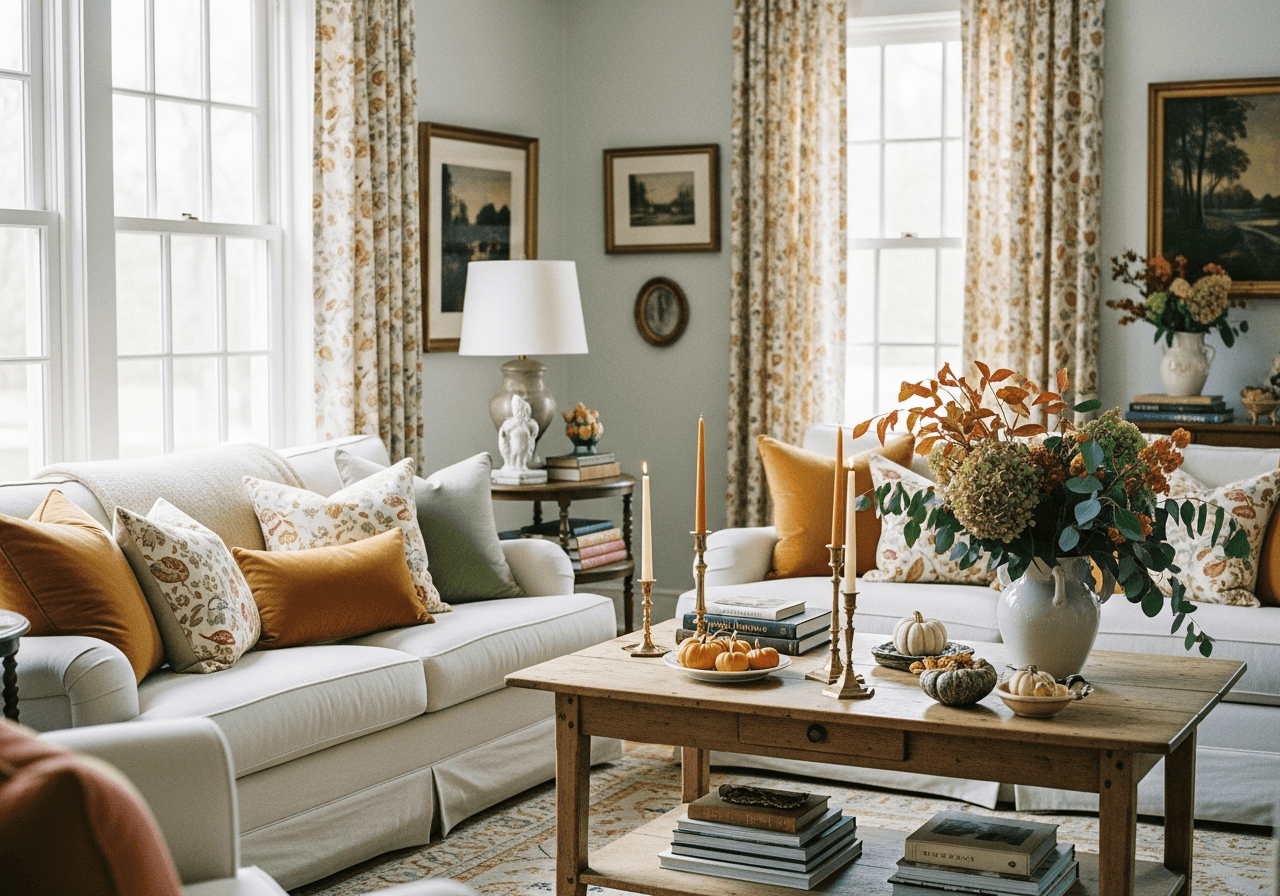
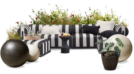
The right contrasting colors can catch a user’s attention or make a guest feel right at home. For example, black, white, and gray are timeless colors that are easy to pair with pieces because they set a sturdy foundation that can amplify other shades.
Alternatively, carefully placing pops of warm colors throughout the house provokes deep emotional responses, and a monochromatic palette oozes familiarity and an all-encompassing mood. Another trick is to focus on darker colors for the floor level and gradually get lighter towards the ceiling to elongate rooms
How Lighting and Wall Colors Impact Your Space

Lighting plays a huge role in how colors look inside your home. A color that appears warm and inviting in one room might look dull in another. Keep these tips in mind:
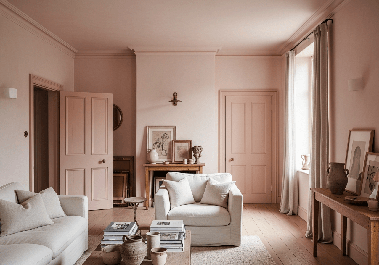
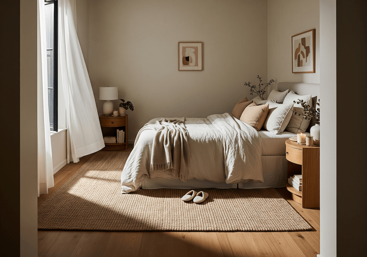
North-facing rooms: Use warm tones like beige, peach, or soft yellow to counteract cool light.
South-facing rooms: Almost any color works, but cool tones like gray and blue balance the bright light.
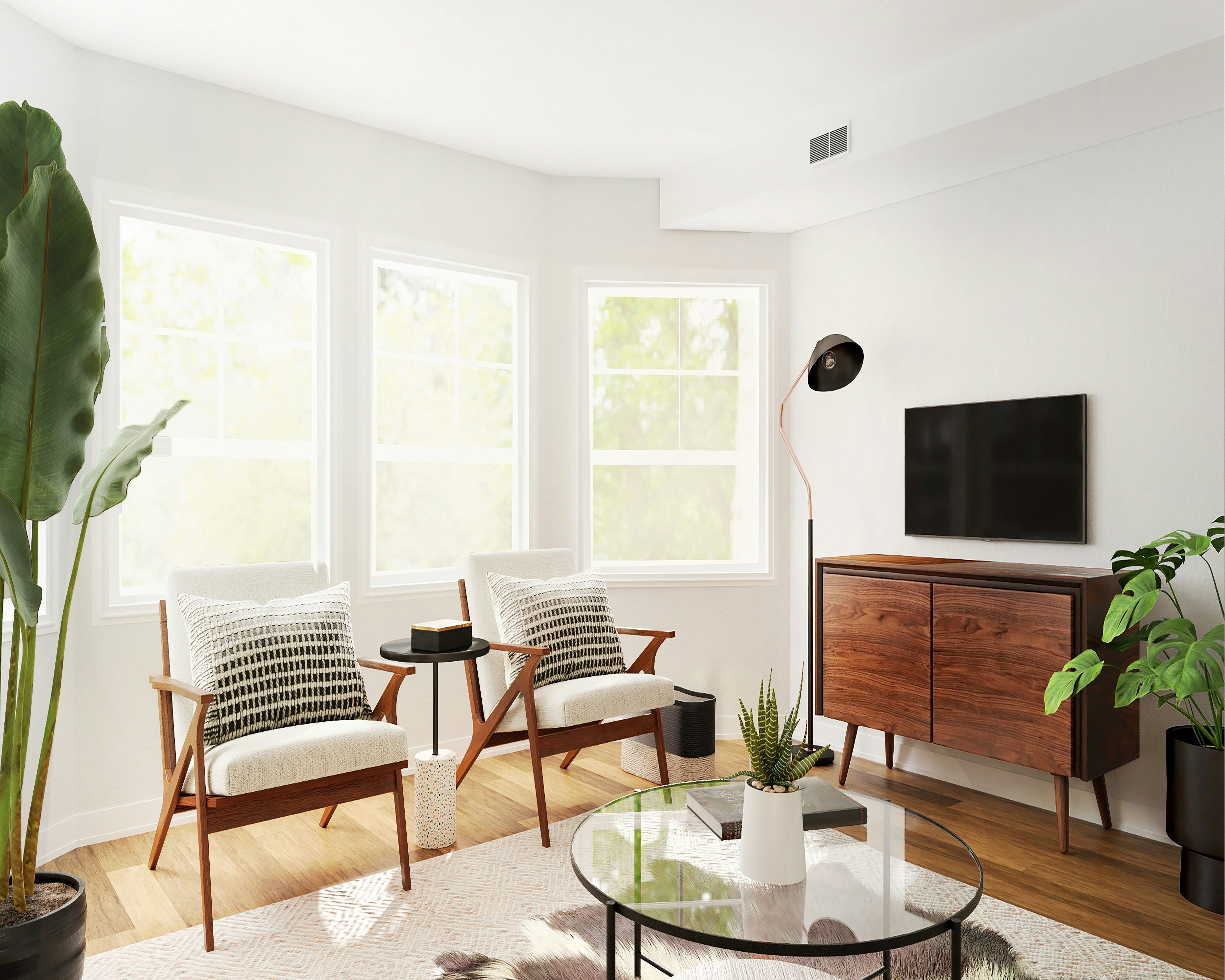
Small rooms: Light, neutral walls make spaces feel bigger and airier.
Dark rooms: Use satin or semi-gloss finishes to reflect light.
Wallpaper is a great way to get color and pattern into the smallest of spaces. It creates a visual impact that isn't too overbearing because it is in a contained area. There are so many great peel-and-stick options too, that even renters can lap up some wallpaper.
Neutral walls will always stand the test of time, but perhaps you can combine them with dark accent walls to bring your space to life. Color trends change every few years, so if you are fearful that painting a whole wall will transform your home’s aesthetic, incorporate color through artwork and accessories.
Ready to design your dream color palette with ease? The DecorMatters app lets you experiment with colors, visualize designs, and bring your vision to life with AI-powered tools. Download the app today and start creating a home that truly reflects your style!
UP NEXT: 10 Eye-Catching Colors to Transform Your Home Decor Today

 22h left