- Design Your Room
- AI Design
- Explore
- Blog

The Foodification of Color: Sweet, Savory, and Tangy Shades to Spice Up Interiors

Color is a visual medium, but it can evoke other senses, too. Foodification adds a new dimension — taste. Food-based color names are taking the internet and interior design spaces by storm, appealing to multiple tastes, emotions, and sensations.
What is the Foodification of Color?
The term “foodification” is still pretty niche, but its concept has been around for a few years — think butter yellow and tomato red. The trend creates strong associations between edible items and color, bridging culinary creations with interior design choices.
Specific foods often have associations with positive memories or pleasurable sensations, making them perfect for describing colors in fashion or interior design. Using culinary terms creates a multi-sensory experience that expands a color’s visual impact.
Food and color have always had strong psychological connections. A study published in 2025 found that the colors of food and tableware can significantly influence a person’s cravings.
5 Foodified Colors for Spicing Up Interiors
Food can come in many different colors, but a few have stood out over the past few years. Here are five shades to look out for in the coming months.
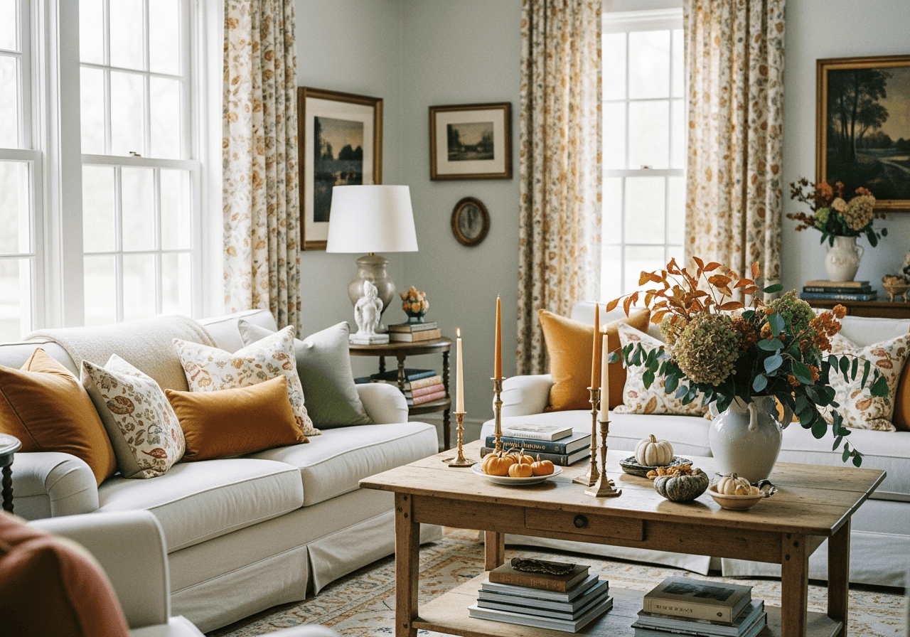
1. Butter Yellow

This soft, pale yellow shade is the poster child of foodification. It has made its rounds on fashion runways and home interiors worldwide. Some suspect butter yellow’s resurgence began with the butter sculpture revival in the early 2020s, where chefs and food artists created elaborate structures from dairy products.
2. Mocha Mousse

Mocha mousse is another strong contender, especially with its Pantone endorsement. According to the company’s color of the year release, this brown hue embodies richness and comfort through its association with coffee. The neutral shade represents the world’s search for stability and works well with bold and neutral colors.
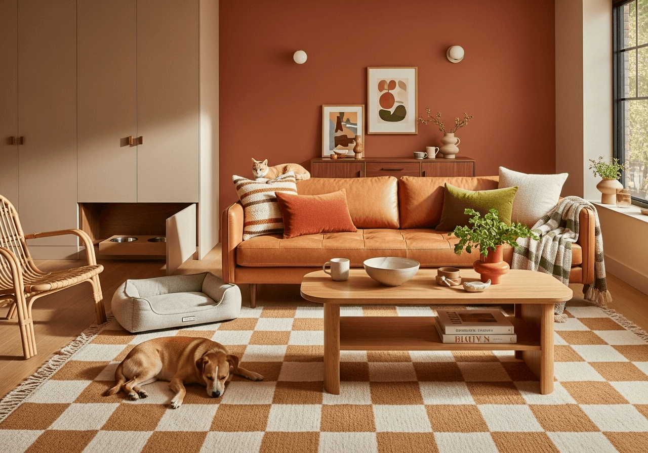
3. Martini Olive Green
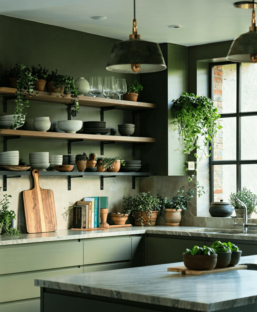
Various shades of green are getting their time in the limelight, with martini olive green peaking this year in fashion and interior design. As its namesake suggests, it comes with a sense of maturity and sophistication while maintaining an element of fun. In interior spaces, olive offers a calm, earthy vibe that pairs well with natural woods and neutral tones.
Want to see how these tasty tones could look in your space? Try them out virtually with the DecorMatters app—no paint required.
4. Tomato Red

Tomato red continues its bold impression as designers incorporate this bright, energetic shade into their interiors. The attention to this color likely originated from TikTok’s tomato girl summer trend, which embodied a carefree attitude, food-themed accessories, and bright colors, tomato red being one of them.
5. Blueberry Milk

TikTok is a rising hitmaker, with the blueberry milk shade also getting its origins on the platform. While mostly seen on manicures, designers can use it to add color subtly into the home. This muted periwinkle shade is light, airy, and almost pearlescent, bringing a sense of chic whimsy to any space.
Taste the Palette
The connections between food and color create a more sensory experience, making rooms feel more personal and alive. Whether someone opts for the neutral warmth of mocha mousse or the punchiness of tomato red, foodified color palettes are best for crafting unique spaces and setting a mood.
Feeling inspired to experiment with these deliciously bold shades? Download the DecorMatters app to visualize food-inspired colors in your own space, play with design ideas, and bring your unique vision to life with ease.
UP NEXT: 10 Eye-Catching Colors to Transform Your Home Decor Today
 22h left