- Design Your Room
- AI Design
- Explore
- Blog

How Boho Color Palettes Can Balance Modern Minimalist Interiors
Minimalist interiors offer a clean slate, but they can sometimes feel a bit too sterile — almost as if their personality has been scrubbed away in all the white. Enter bohemian palettes. Boho colors introduce the perfect hues to warm up crisp spaces without the overwhelming extravagance of true bohemian décor.
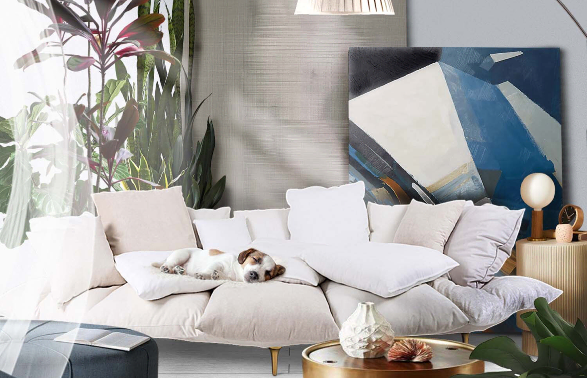
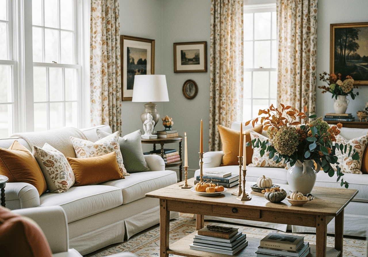
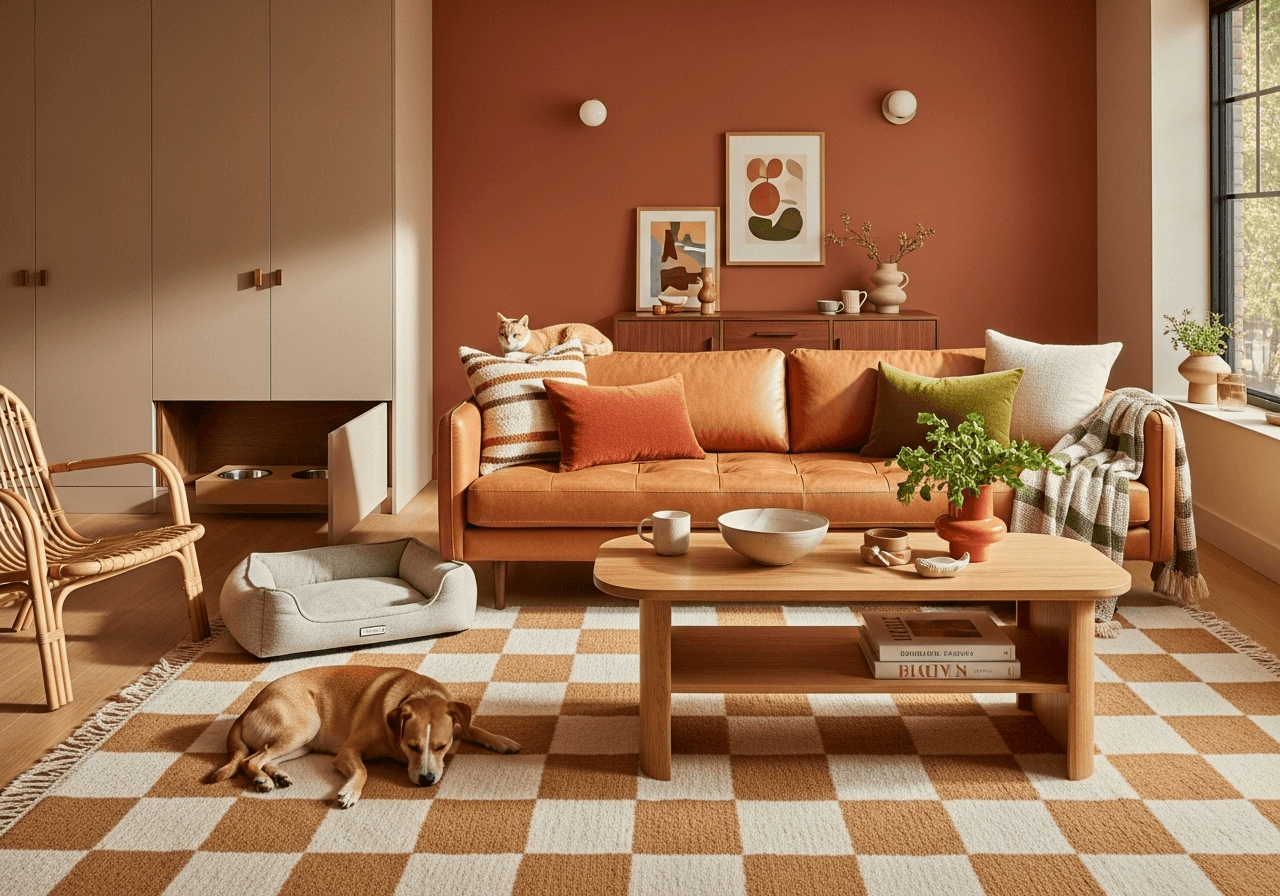
Picture a rust-colored throw casually draped over a sleek, light gray sofa or a muted teal accent wall, adding just the right touch of character. By drawing inspiration solely from color, homeowners can maintain a modern aesthetic without overwhelming the space with excessive detail.
What Is a Boho Color Palette?

A boho color palette is a painter’s dream. It’s rooted in eclectic, free-spirited aesthetics that underscore creativity, warmth and personalization. Unlike the monochromatic and impersonal tones of minimalism, boho shades reflect colors so vibrant they might as well tell a story. Some common hues include:
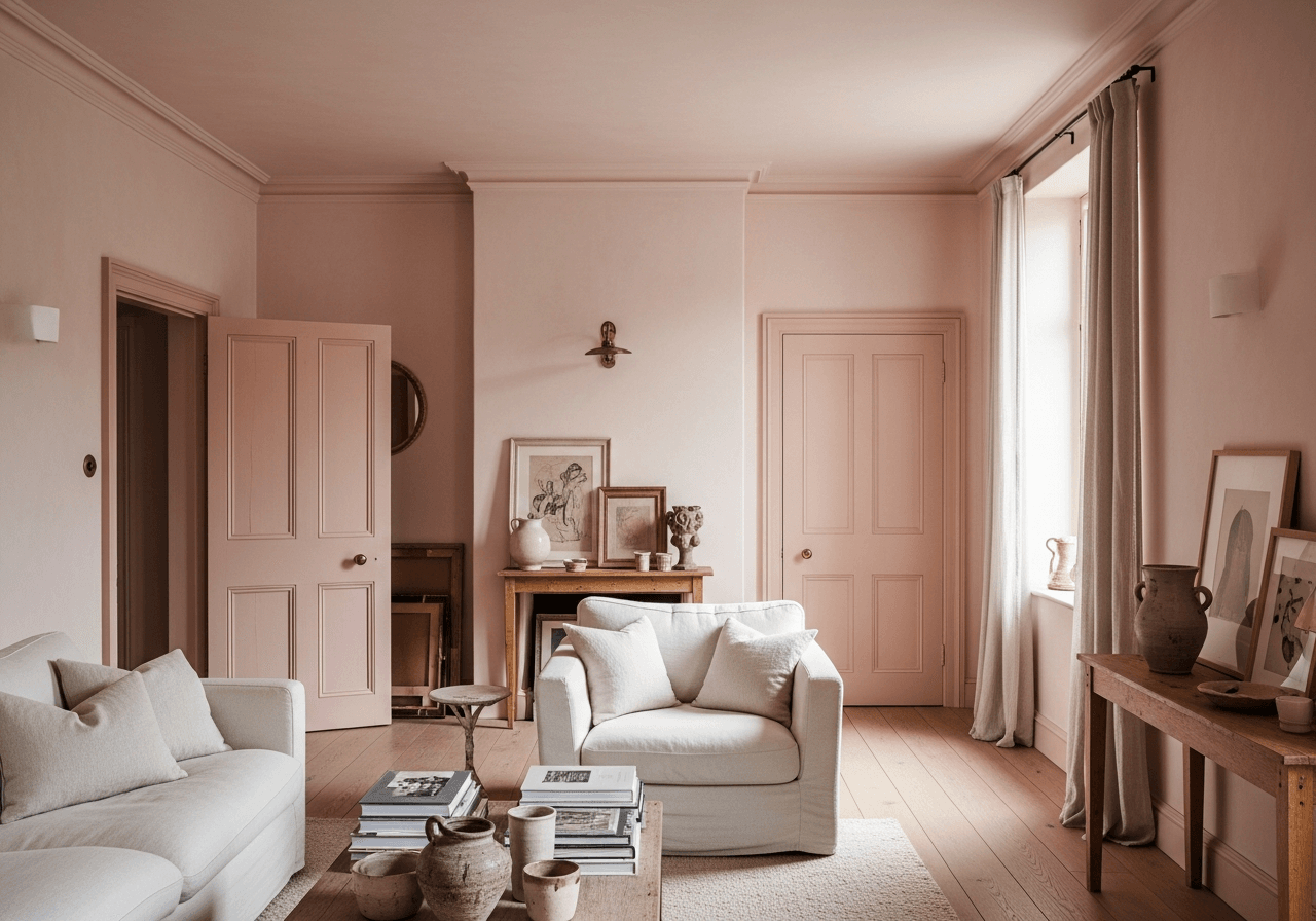
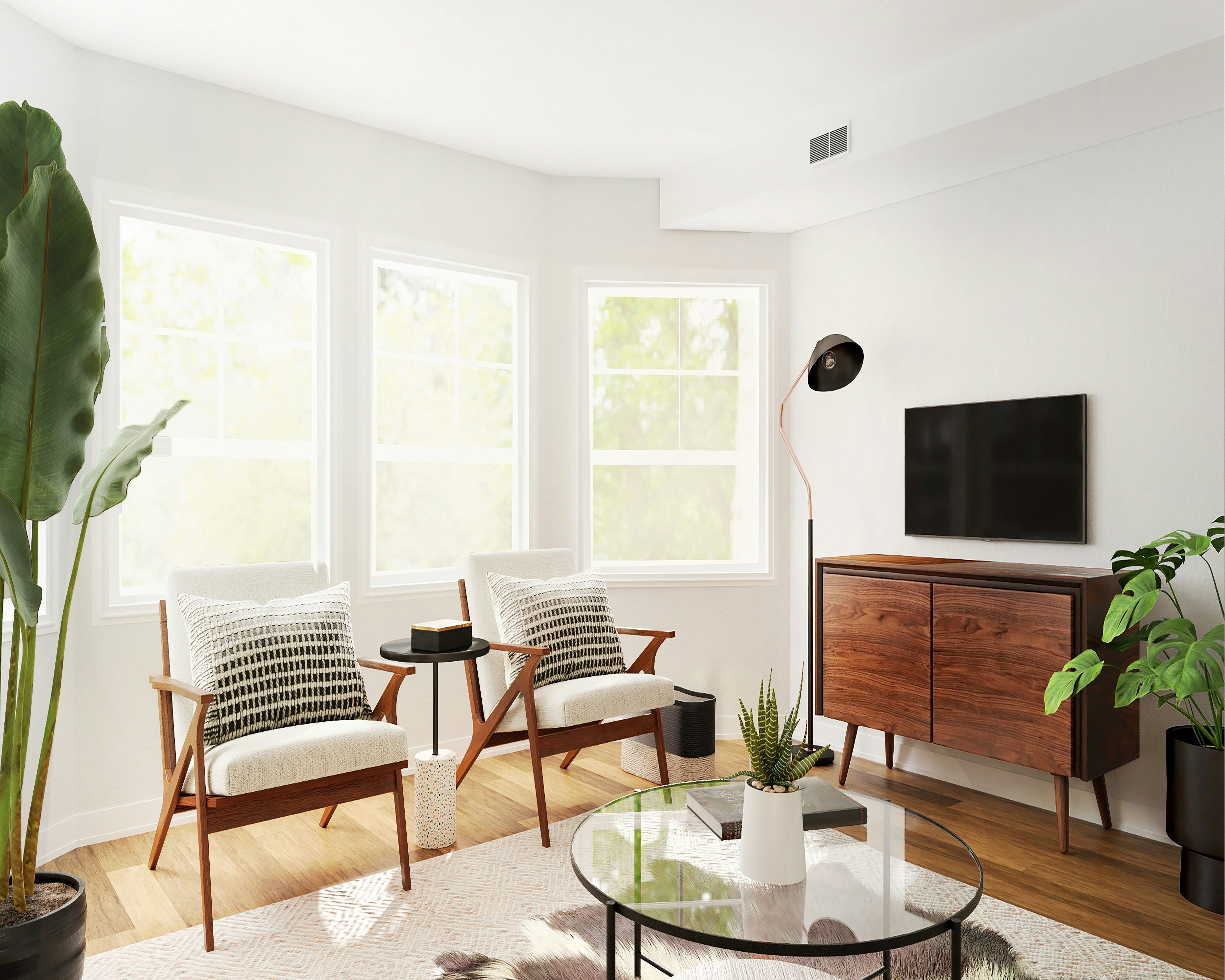
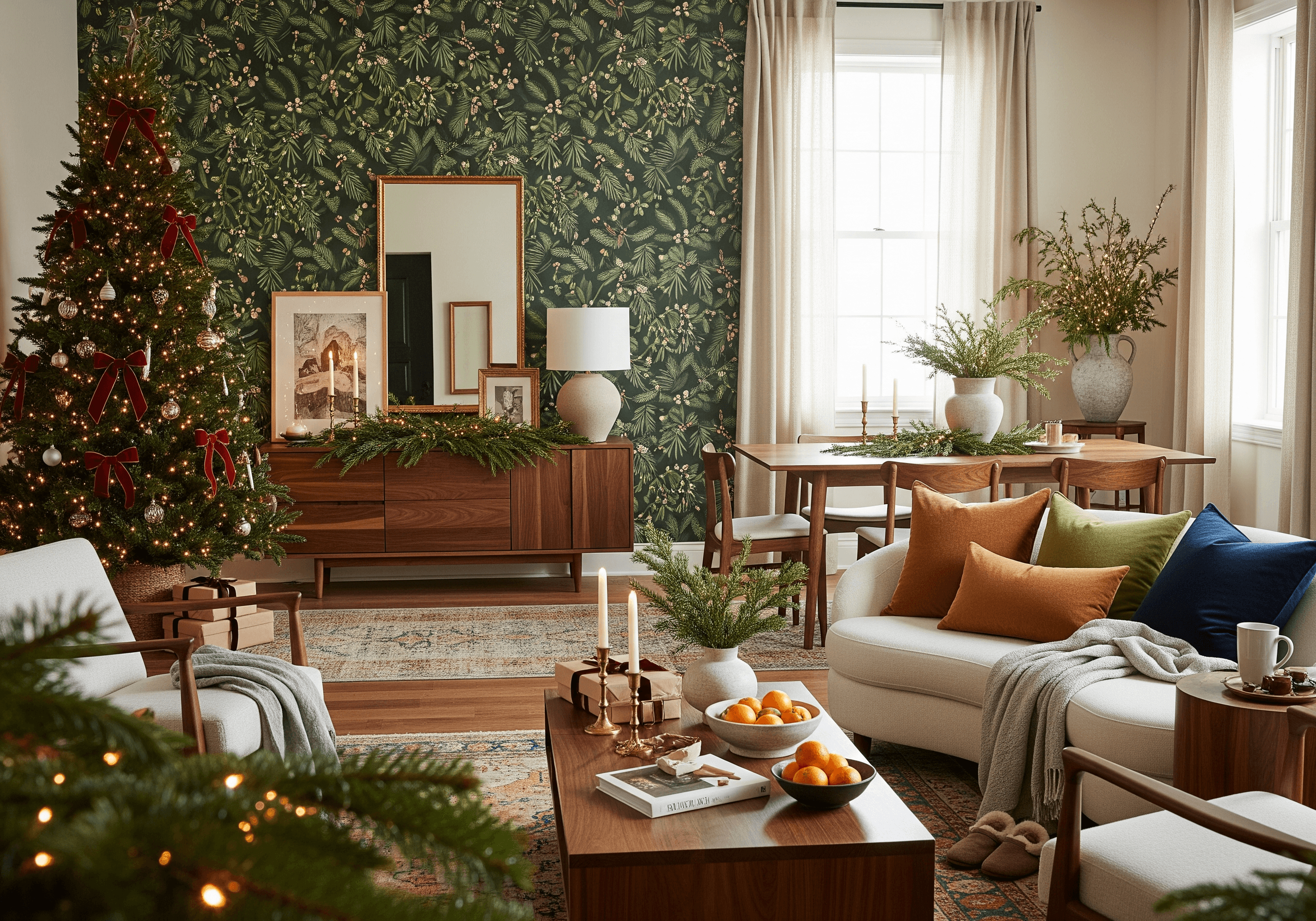
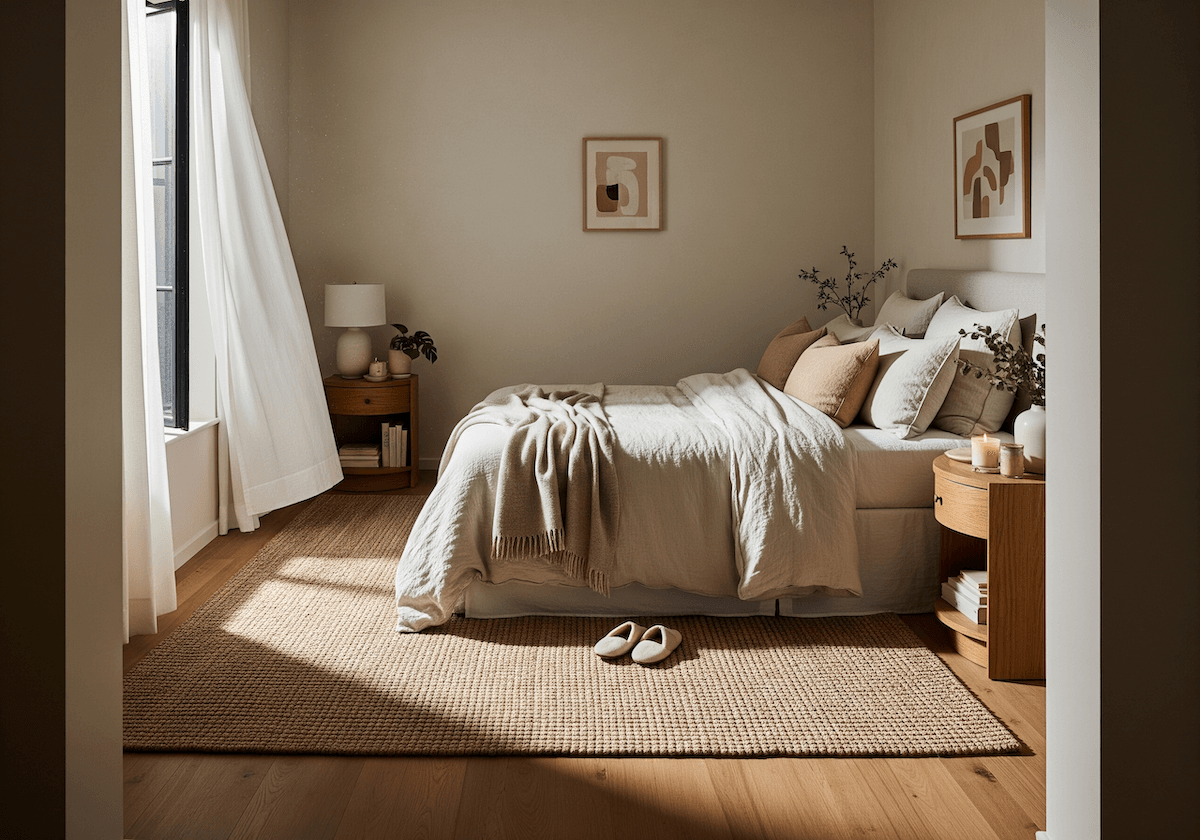
- Earthy neutrals: Beige, taupe, warm gray and off-white serve as a grounding base. These shades never go out of style and are more of a homey option than plain, stark white.
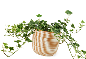
- Terra cotta and rust: These warm tones are inspired by nature and add depth and contrast. These natural, earthy, rich schemes evoke the warmth and groundedness of clay soils as if telling people to live a slower lifestyle.
- Mustard and ochre yellow: These bright yet muted colors inject energy without overwhelming the space. Yellows automatically bring an uplifting vibe, evoking sunshine.
- Sage and olive green: These soft, earthy greens make spaces feel fresher. They offer a similar neutrality as gray but with more depth and personality. About 48% of professionals say earthy greens will dominate in 2025.
- Deep blues and teals: Cool and rich tropical teals bring life to any room, while deep blues offer calmness and sophistication.
- Blush pink and dusty rose: Blush pink reminds of activeness, like blood coming to the surface of the skin, giving a sense of warmth and energy. Dusty rose is a grayer, deeper, more romantic color that exudes elegance and stability.
Why Are Boho Colors Trending?

While the whole bohemian aesthetic conjures memories of macrame wall decor and tie-dyes, today’s boho revival is different from what people remember. It’s about a more lived-in feel with intentional touches. Consider it a rejection of matching everything. The trend is growing in popularity again, thriving on runway stages and flooding fashion houses. The vibrant colors are rubbing into home decor but with a fresh and modern take.
The rise of biophilic design — which incorporates nature into home decor — has also pushed the appeal of earthy and botanical hues, which also coincide with boho palettes. The trend is that people are moving toward warmer, nature-inspired interiors as a reaction to the cold, tech-heavy spaces that dominated the interior design world in previous years.
Blending Boho Colors With Modern Minimalism
The key to merging boho with modern minimalism is balance. The same warm, neutral tones that make a living room feel cozy can extend to a home’s facade — a deep teal front door, a terra cotta walkway or pampas grass lining a modern concrete patio. By thinking holistically, homeowners pull together an effortlessly bohemian look inside and out.
1. Start With a Neutral Base

Neutrals are failproof, and minimalists know this all too well. However, skip the white, gray and beige. Warmer colors like cream and sand are more appealing options. They glow in natural light, while cooler shades feel empty and bland. Warm neutrals provide a softer, more organic backdrop that will easily accommodate additional boho hues. Even real estate professionals agree that stark whites are losing appeal and can drop a home’s value by over $600.
2. Use Boho Tones as Accents

The magic of boho minimalism is in the details. A crisp white living room comes alive when colors are brought into the picture.
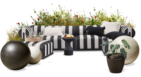
- Throw pillows and blankets in rust, mustard or teal for a subtle pop of color
- Wall art and decor featuring abstract or nature-inspired patterns
- Area rugs with earthy tones to add warmth and texture
- Ceramic vases and planters in terra cotta or deep blues
- Front door color choices like deep teal, muted navy or warm mustard to create an inviting entry
3. Introduce Natural Materials

Natural materials bridge the gap between boho warmth and minimalist restraint. Cane and rattan materials enhance visual interest in the otherwise sterile palette of a sleek white kitchen island. A wooden dining table with a clean silhouette pairs beautifully with linen-draped chairs, softening the space without clutter. Even outdoors, a concrete patio gains character with wicker seating and terra cotta planters overflowing with rosemary and lavender.
4. Layer With Texture

Minimalism thrives on clean lines, but without texture, it can feel lifeless. Layering is key — complete the room with a textured accent wall, a linen duvet with a chunky knit blanket at the foot of the bed or stoneware dishes on a sleek quartz countertop.
Go for Simplicity With Soul
Modern minimalism and boho design don’t have to be opposites. When done right, they create spaces that feel both grounded and sophisticated — houses that are as calming as they are expressive. By blending clean lines with rich textures and earthy hues, homeowners create a home that isn’t just stylish — it’s alive.
Ready to experiment with boho color palettes in your own space? With the DecorMatters app, you can visualize different color combinations, layer textures, and bring modern minimalist interiors to life—all from your phone. Download the app today and start designing with confidence and creativity.
UP NEXT: How to Create the Perfect Color Palette for Your Home: Expert Tips & Inspiration
 22h left